Analysis
Jumoke Ajakaiye and Ricardo David Barragan Martinez
5/23/2021
1 Meat consumption data set analysis (08.04.2021)RM
1.1 Information after cleaning
(please see the cleaning link to observe the cleaning code).
1.2 General information of the meat consumption data frame
The data frame presents the information of different kinds of meat. The information is presented by the Kg per capital. This can be seen as the average consumption of the total population in a year. The next information present an example of the data and the summary of the types of the variables.
## Rows: 9,294
## Columns: 8
## $ entity          <chr> "Afghanistan", "Afghanistan", "Afghanistan", "Afghanis…
## $ code            <chr> "AFG", "AFG", "AFG", "AFG", "AFG", "AFG", "AFG", "AFG"…
## $ year            <dbl> 1961, 1962, 1963, 1964, 1965, 1966, 1967, 1968, 1969, …
## $ mutton_goat_kg  <dbl> 8.18, 7.92, 8.09, 8.35, 8.64, 8.98, 9.81, 10.64, 9.91,…
## $ other_kg        <dbl> 0.85, 0.88, 1.07, 1.01, 1.06, 1.03, 1.11, 1.08, 1.06, …
## $ poultry_kg      <dbl> 0.63, 0.66, 0.66, 0.67, 0.70, 0.72, 0.74, 0.76, 0.89, …
## $ pigmeat_kg      <dbl> 0, 0, 0, 0, 0, 0, 0, 0, 0, 0, 0, 0, 0, 0, 0, 0, 0, 0, …
## $ beef_bufallo_kg <dbl> 4.80, 5.01, 5.06, 5.03, 4.99, 6.81, 6.36, 6.78, 6.99, …
1.3 Summary of the meat consumption data frame
As it can be observed, the data was collected from 1961 to 2017. The meat that is more eaten based on the mean is the beef/buffallo meat followed by the poultry meat.
## entity code year mutton_goat_kg
## Length:9294 Length:9294 Min. :1961 Min. : 0.000
## Class :character Class :character 1st Qu.:1976 1st Qu.: 0.480
## Mode :character Mode :character Median :1991 Median : 1.260
## Mean :1990 Mean : 3.549
## 3rd Qu.:2004 3rd Qu.: 3.880
## Max. :2017 Max. :61.340
## other_kg poultry_kg pigmeat_kg beef_bufallo_kg
## Min. : 0.000 Min. : 0.000 Min. : 0.00 Min. : 0.00
## 1st Qu.: 0.110 1st Qu.: 1.930 1st Qu.: 0.95 1st Qu.: 4.39
## Median : 0.690 Median : 6.805 Median : 5.13 Median : 8.33
## Mean : 1.927 Mean :11.956 Mean :11.34 Mean :11.98
## 3rd Qu.: 1.850 3rd Qu.:17.777 3rd Qu.:16.49 3rd Qu.:17.00
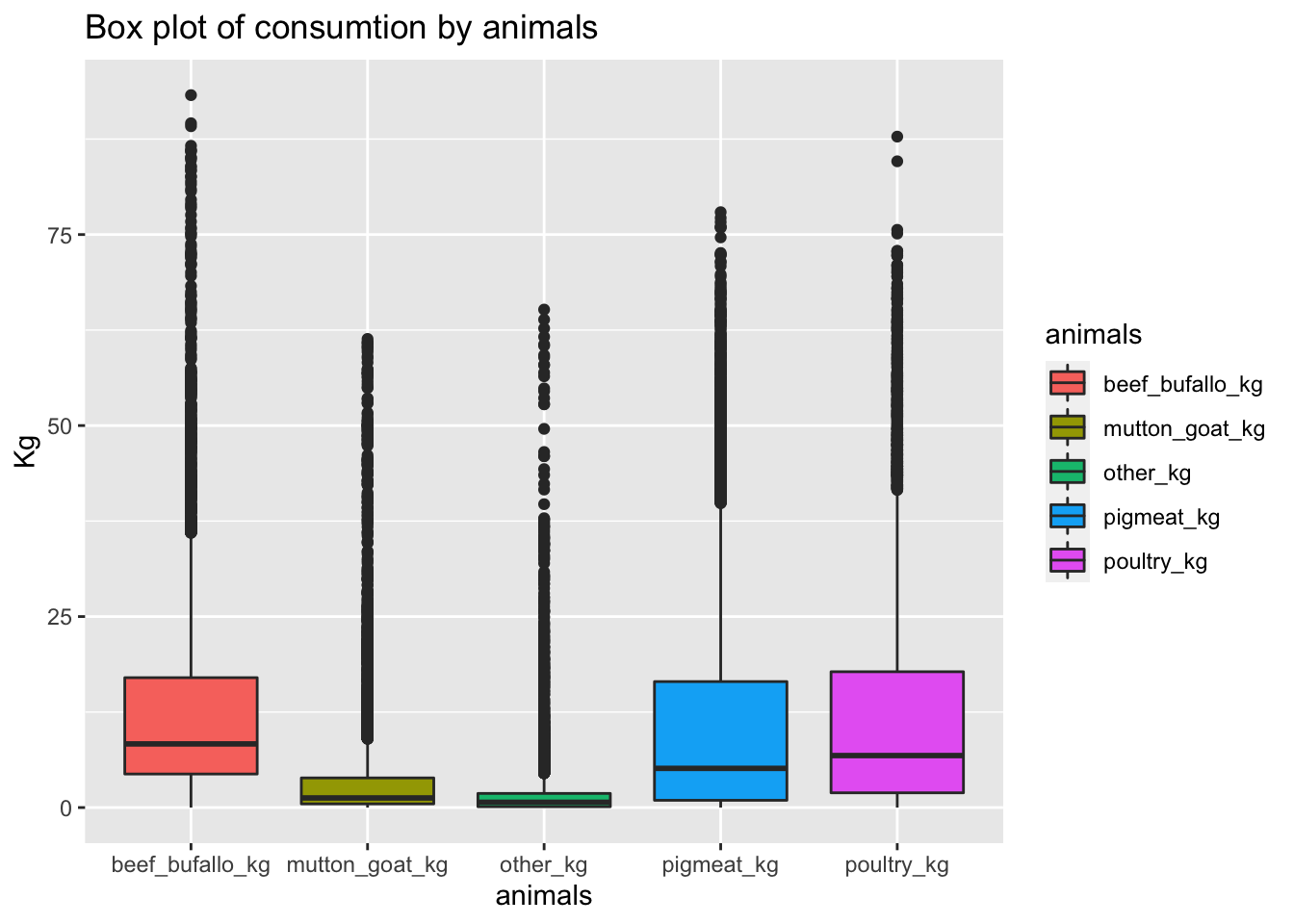
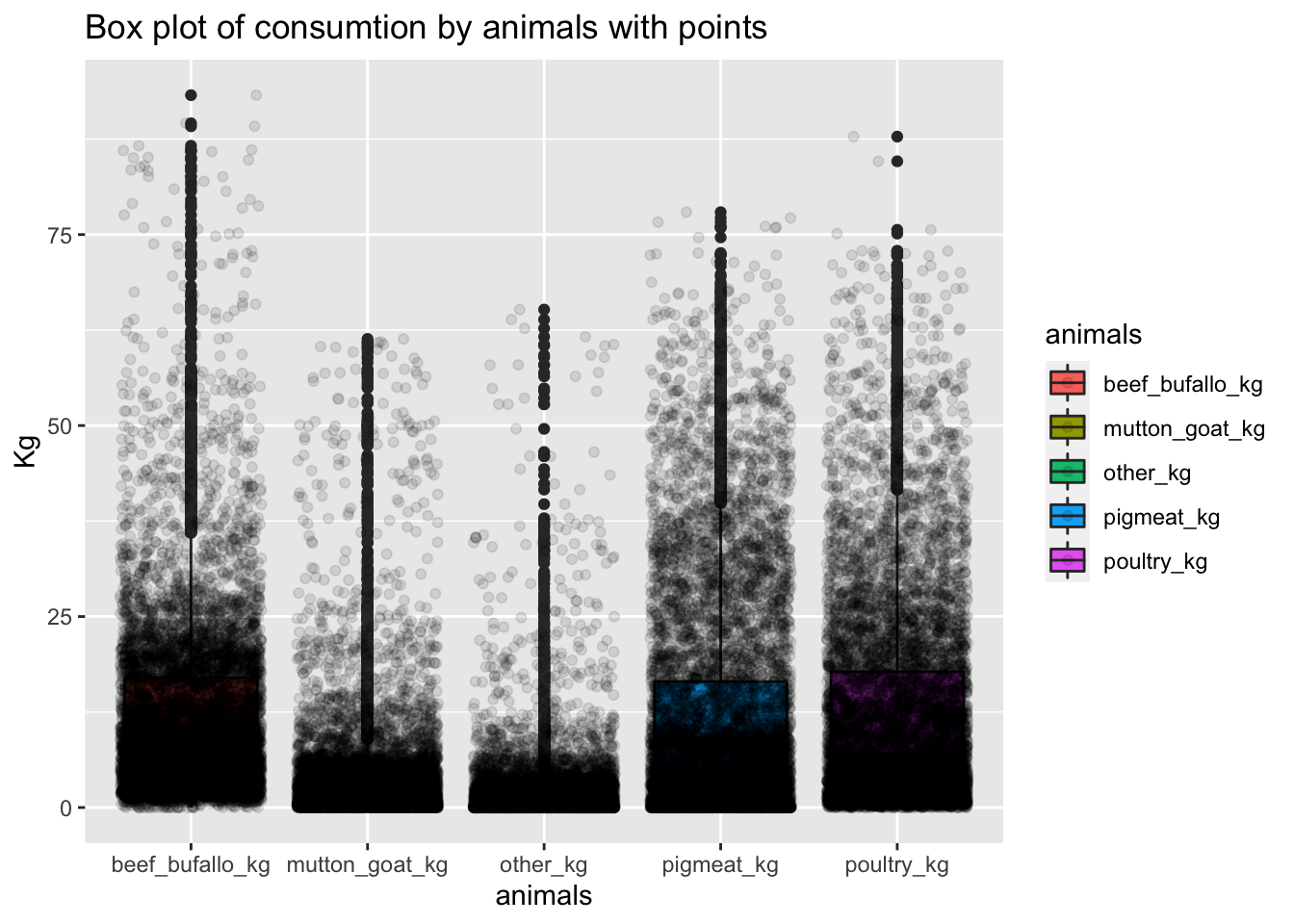
## Max. :65.180 Max. :87.820 Max. :77.93 Max. :93.251.4 Box plot of consumtion by animals
The following box plots show the outliers by animal.As it can be perceived, the meat consumption means are low, this means that most of the countries does not have a high meat consumption. However, there are some countries that have outlier values, which mean that the consumtion is really high in comparison to other countries.
1.5 Transformation to get the top and bottom 5 countries by animals.
As it was perceived in the previous plots, there are some outliers in the data frame. There are some countries that have a high consumption per capta a year. For this project, we are going to focus on the countries with the highest consumtion and the lowest consumtion. We are going to discuss some peculiarities and some insigths.
The following table shows the top and the bottom countries by animals.
1.6 Top 5 countries by animal
The most interesting countries are the countries that consume more meat. As it is known the consumption of meat is against a sustainable development. This is (among other reasons) because the animals need more land in comparison to vegetables. Therefore, the following table show only the top countries that have a bigger meat consumption.
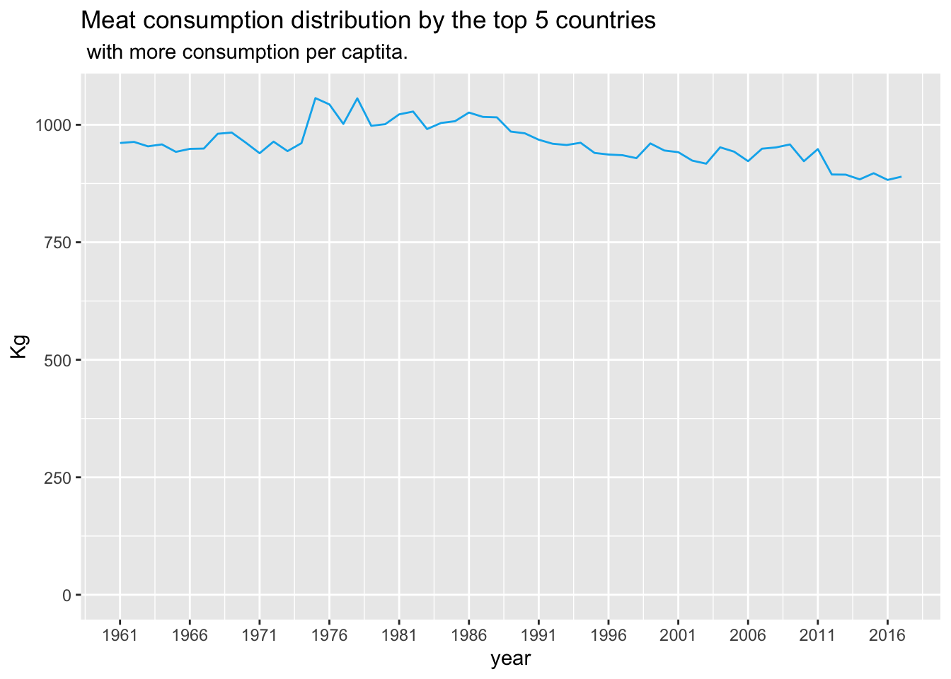
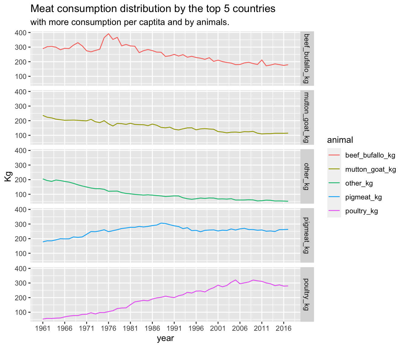
1.7 Meat consumption distribution by the top 5 countries with more consumption per captita.
The following graph shows the trend among the top 5 countries with more meat consumption. The trend seem to be positive as the countries tend to eat less meat. This does not represent that all the countries have the same trend, since the income also plays a role in the access of meat consumption.
It is important to observe that the following graph shows the aggregation of data. This means that the following graph represents the sum of the consumption among the top countries by animal and by country, but the data is aggregated to observe the trend among the gathered information.
 ## Meat consumption distribution by the top 5 countries with more consumption per captita and by animals.
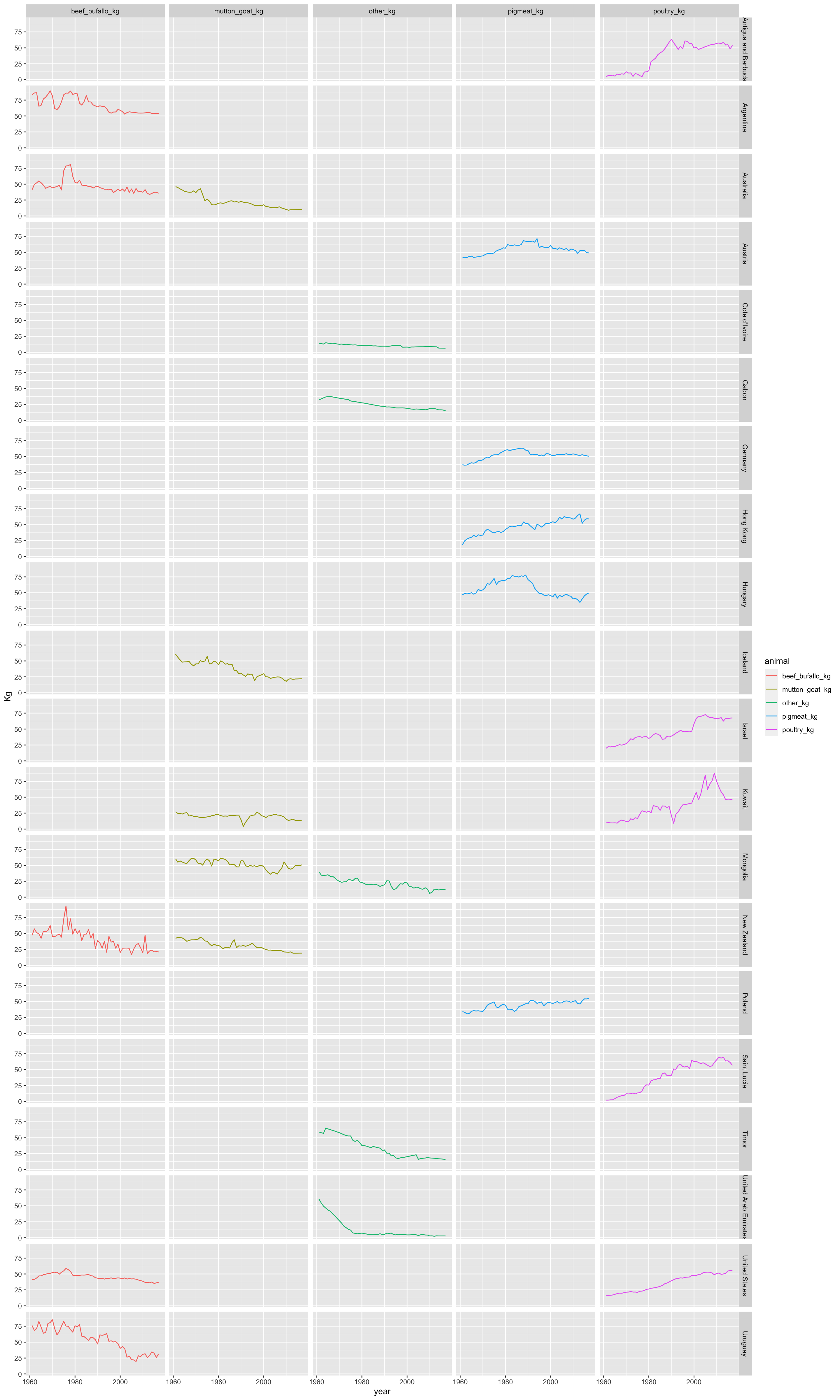
As it was observed the meat consumption seem to decrease. However, in the previous graph was not possible to observe if the consumption decreased in general or in a particular type of meat. The following graphs show the consumption trend by type of meat.
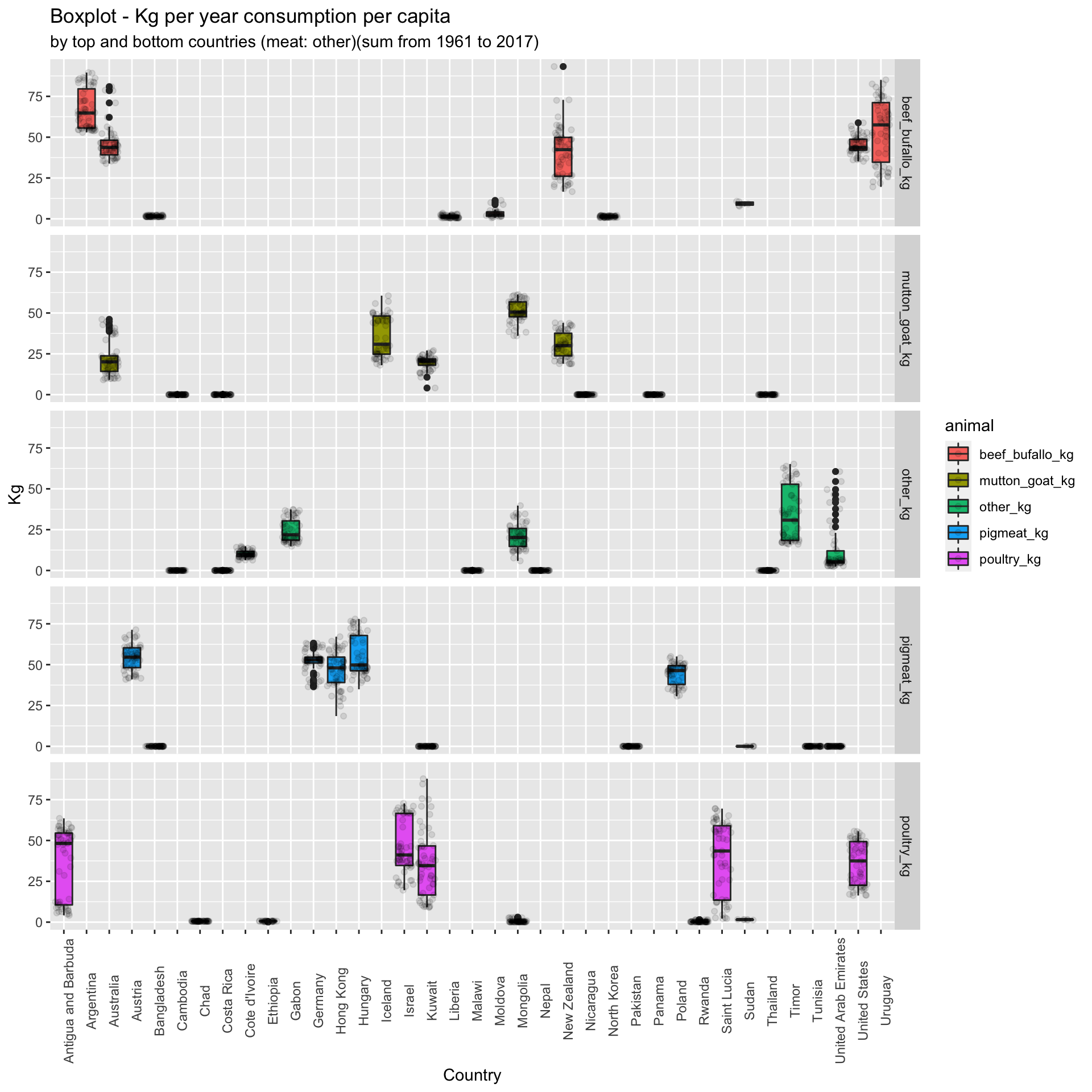
 ## Boxplot of meat consumption per capita by animal type and country
The following boxplots will show the distribution of the data. This will also display the mean and the outliers.
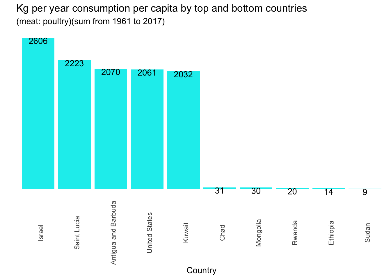
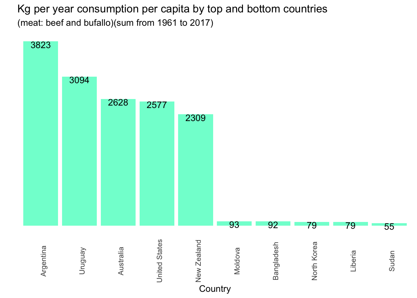
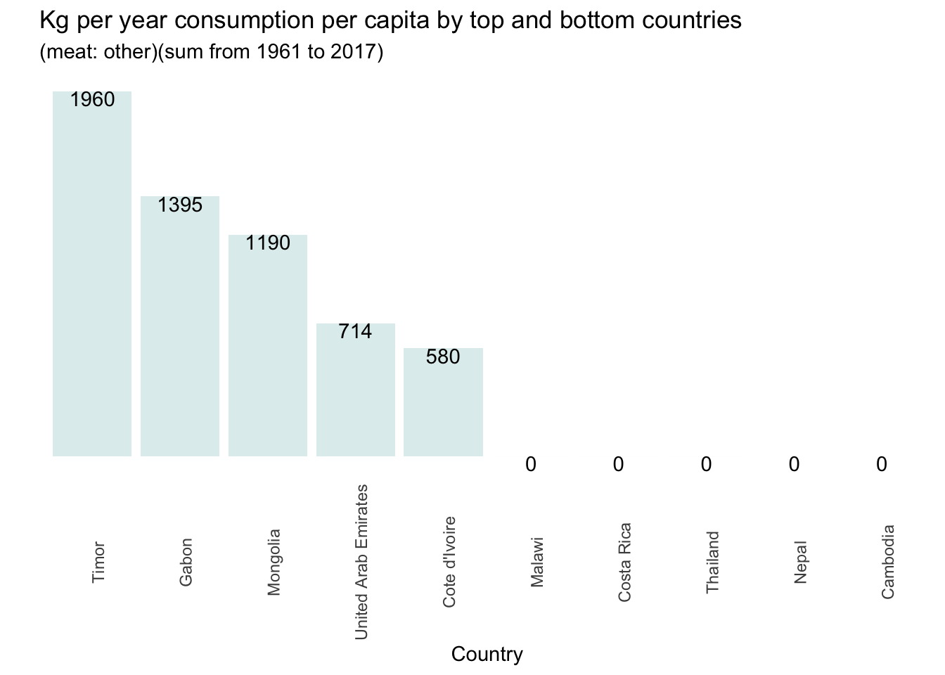
1.8 Consumption per capita by top and bottom countries and by meat type
The following graphs show the aggregate sum of the consumption by country.
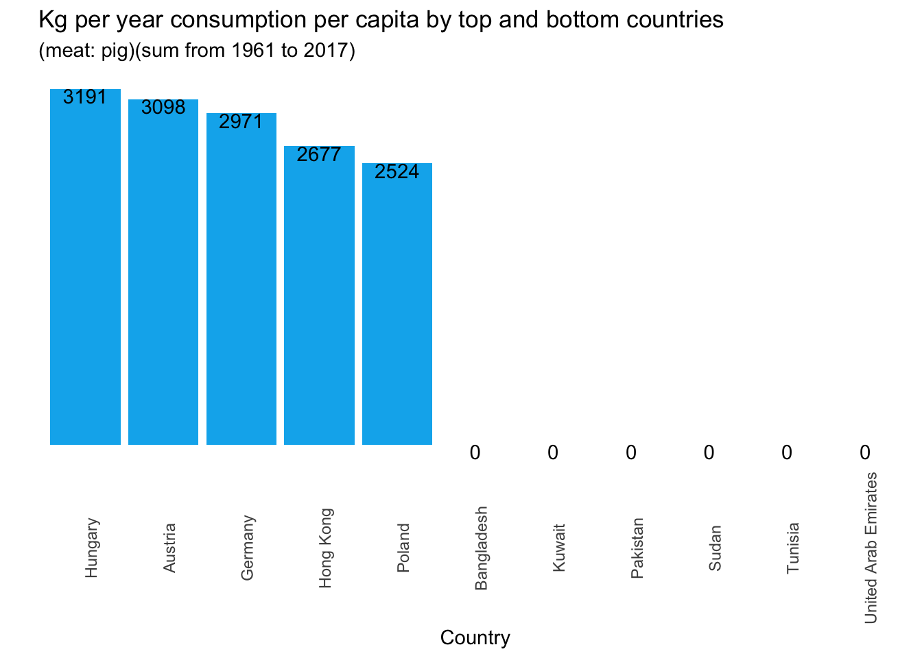
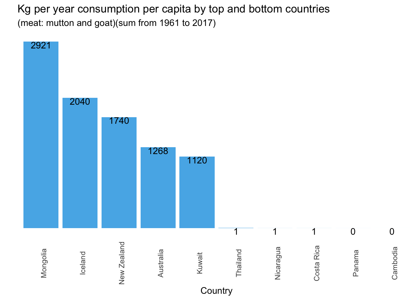
 ## Meat consumption by country and by meat type
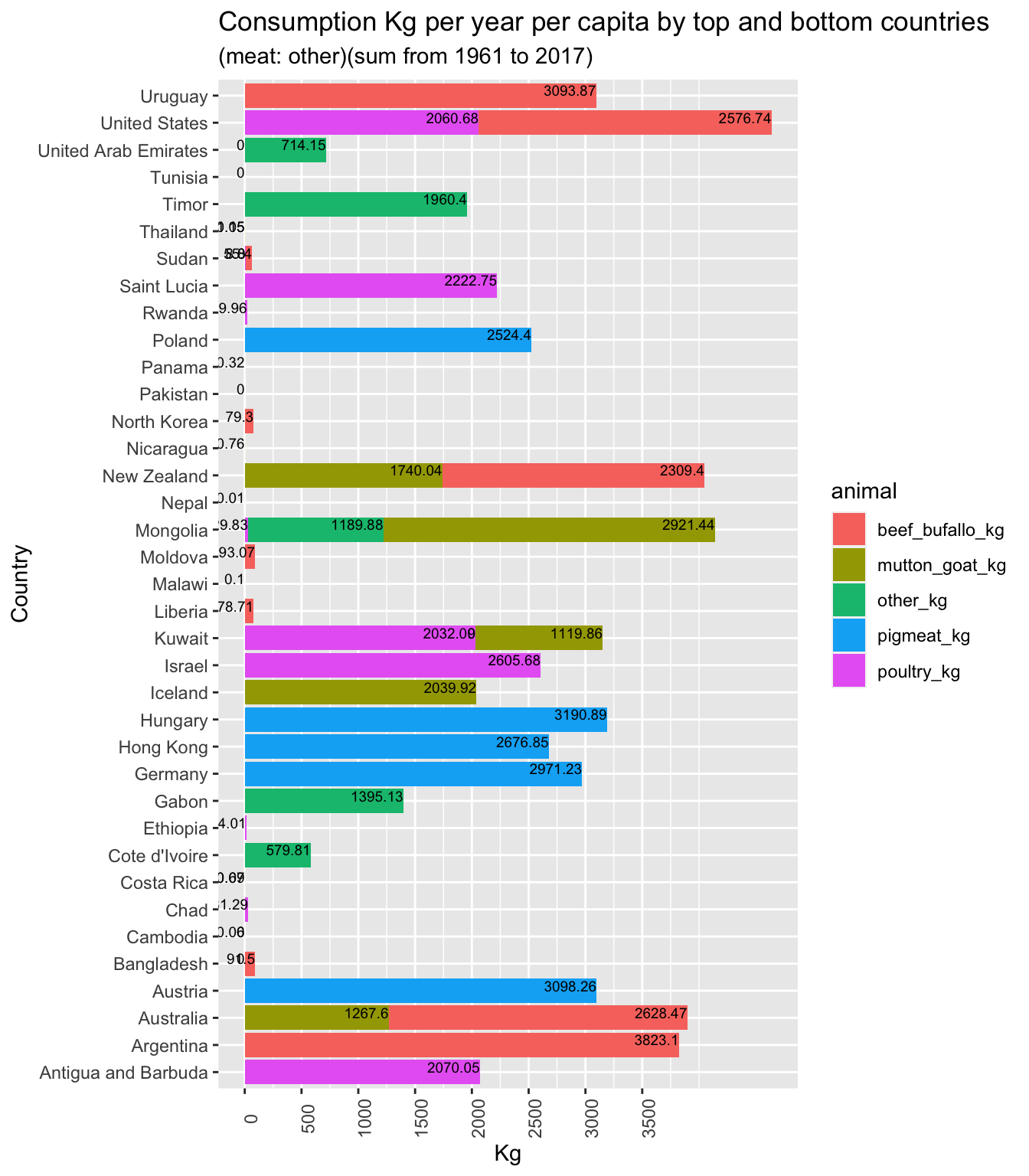
1.9 Meat consumption per capita by top and bottom countries (stacked)
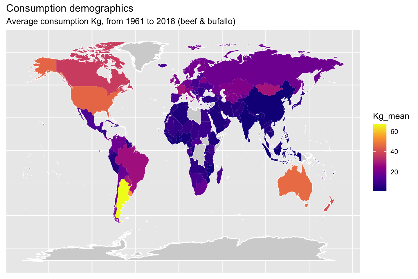
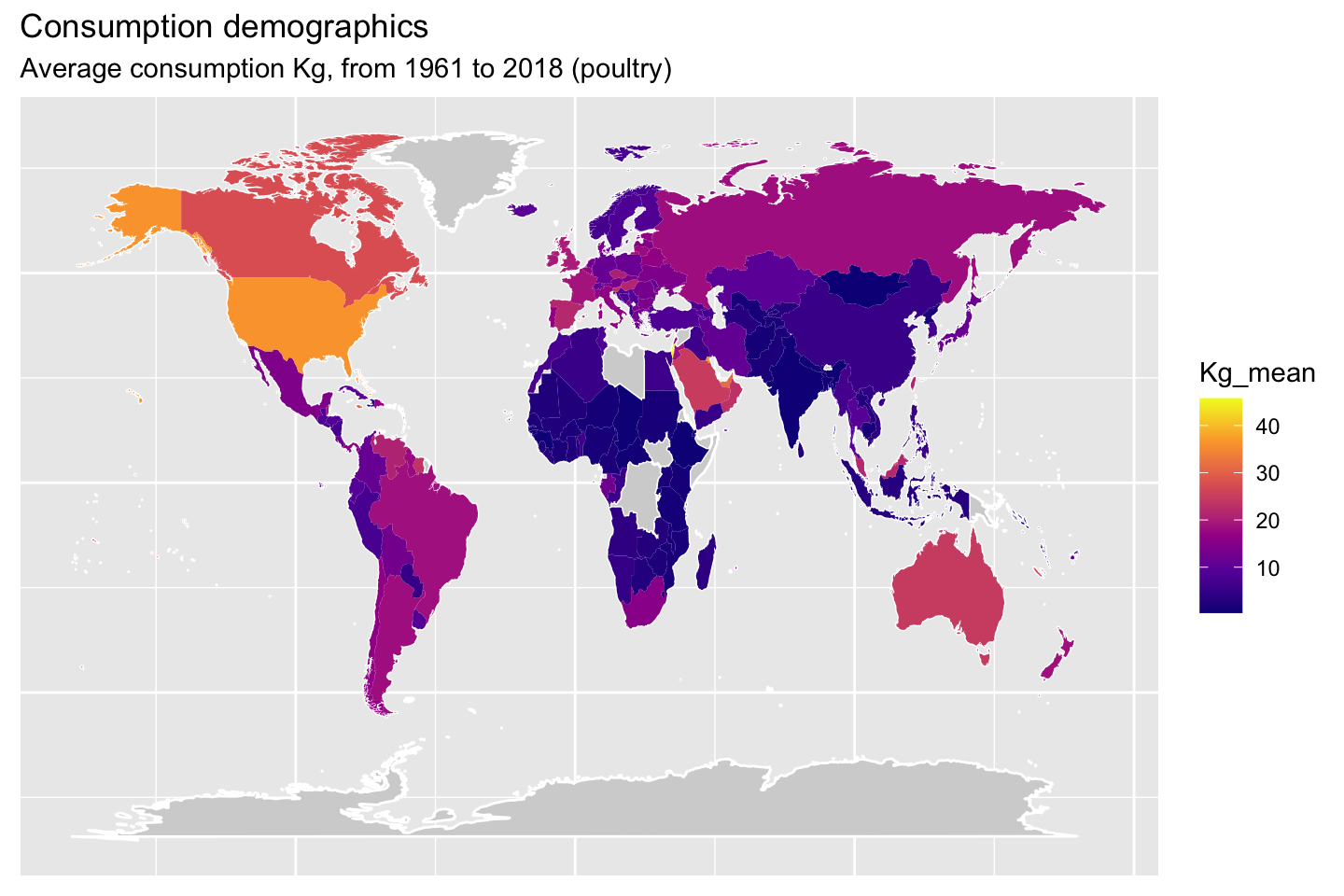
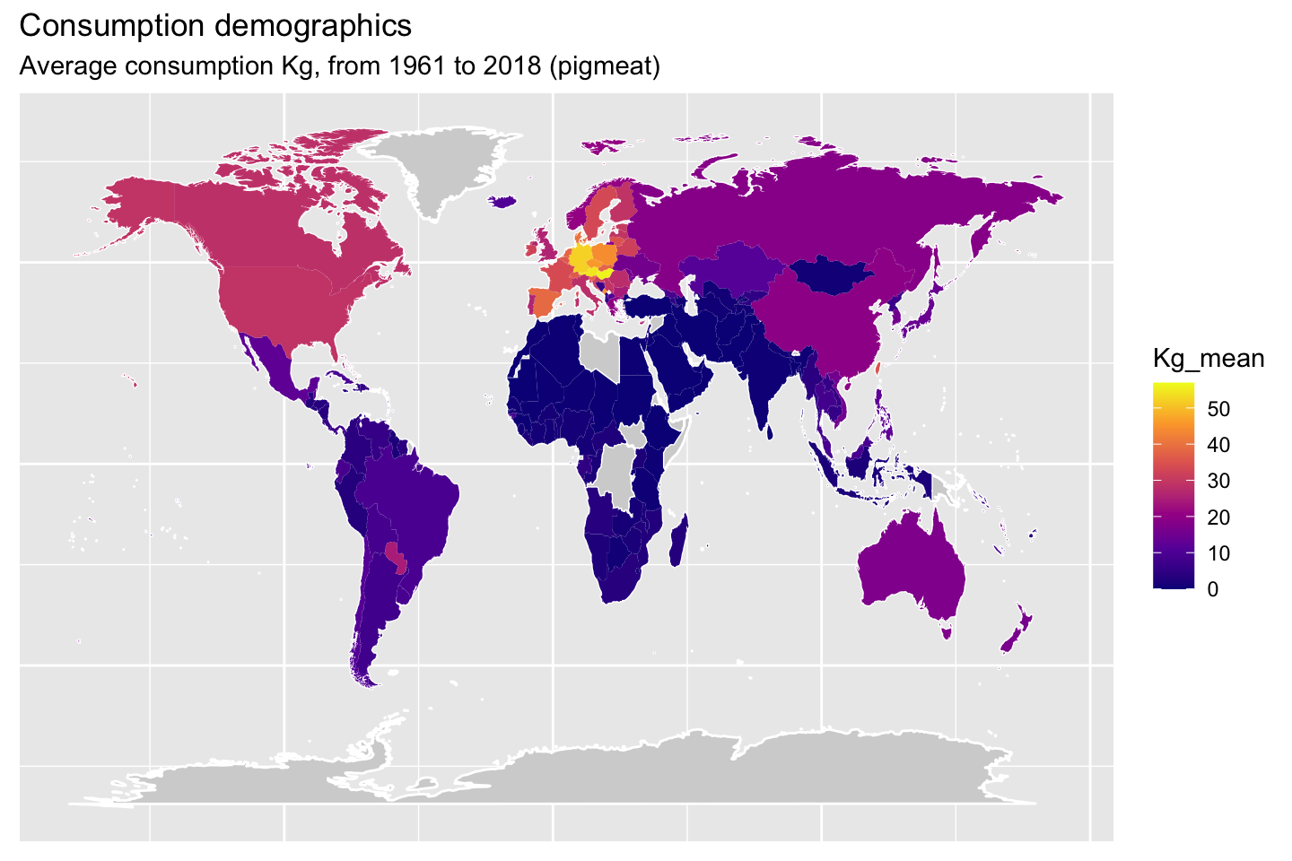
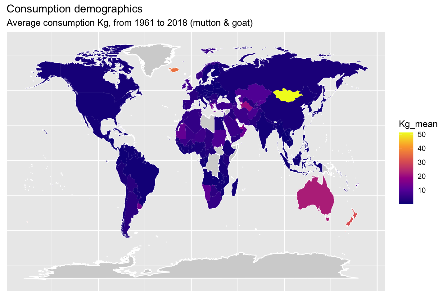
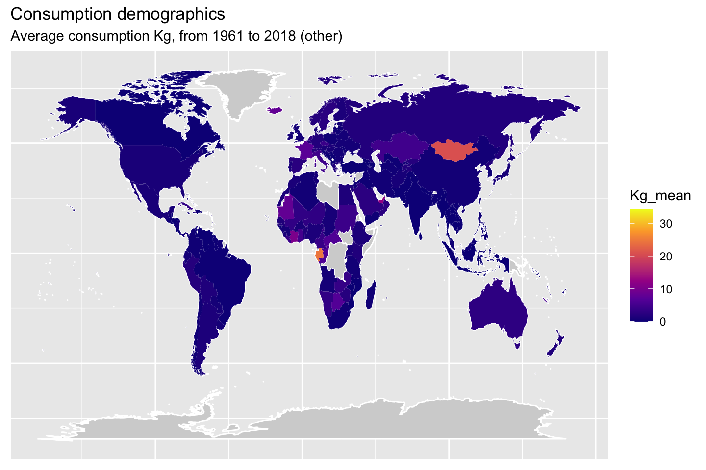
1.10 Demographic maps (consumption)
The following maps will show the mean consumption by animal type.
2 Meat production data set analysis (08.04.2021)JA
2.1 Information after cleaning
#Formatted the columns titles to lowercase, filtered OWID_WRL, and NA in the country_code column
v2_productiondf <- production_df <- clean_names(production_df) %>%
  rename(country = entity,
         country_code = code,
         production = `livestock_primary_meat_total_1765_production_5510_tonnes_tonnes`) %>%
  filter(!is.na(country_code)) %>%
  filter(country_code != "OWID_WRL")
2.2 General information of the meat production data frame
#Data summary of the data frame
head(v2_productiondf)glimpse(v2_productiondf)## Rows: 11,584
## Columns: 4
## $ country <chr> "Afghanistan", "Afghanistan", "Afghanistan", "Afghanistan…
## $ country_code <chr> "AFG", "AFG", "AFG", "AFG", "AFG", "AFG", "AFG", "AFG", "…
## $ year <dbl> 1961, 1962, 1963, 1964, 1965, 1966, 1967, 1968, 1969, 197…
## $ production <dbl> 129420, 132206, 138971, 143830, 150195, 175210, 184232, 2…2.3 Summary of the meat production data frame
summary(v2_productiondf)## country country_code year production
## Length:11584 Length:11584 Min. :1961 Min. : 2
## Class :character Class :character 1st Qu.:1976 1st Qu.: 9556
## Mode :character Mode :character Median :1991 Median : 94270
## Mean :1990 Mean : 945124
## 3rd Qu.:2005 3rd Qu.: 439381
## Max. :2018 Max. :884195302.4 Grouped the countries and summarized the production
# Total production of meat
p_countries <- v2_productiondf %>%
  select(c(country, production)) %>%
  group_by(country)%>%
  summarise(production = sum(production)) %>%
  arrange(desc(production))
2.5 5 Top Countries producing meat.
p_countries %>%
  select(country,production) %>%
  head(n=5)
2.6 5 Bottom Countries producing meat.
p_countries %>%
  select(country, production) %>%
  tail(n=5)
2.7 Bottom Countries Bar graph of production
# Graph showing the lowest countries producing meat from 1960-2018
p_countries %>%
  select(country, production) %>%
  arrange(production) %>%
  head(n=5) %>%
  ggplot(aes(x=country, y=production, fill=production))+
  geom_col()+
  theme(axis.text.x = element_text(angle = 50, hjust=1))+
  labs(y="Production", x= "Country",title="Bottom Countries - Global Meat Production", subtitle ="between 1960 to 2018")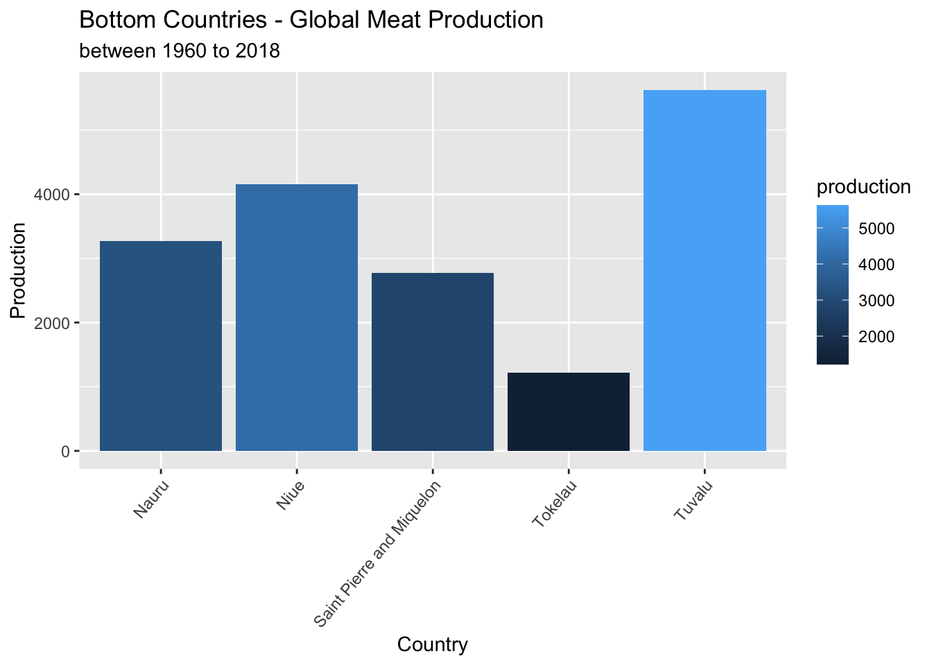
2.8 Top Countries Bar graph of production
#Graph showing the top countries producing meat from 1960-2018
p_countries %>%
  select(country,production) %>%
  head(n=5) %>%
  mutate(production = production / 1000000) %>%
  ggplot(aes(x=country, y=production, fill=production))+
  geom_col() +
labs(y="Production in Million.", x= "Country",title="Top Countries - Global Meat Production", subtitle ="between 1960 to 2018") 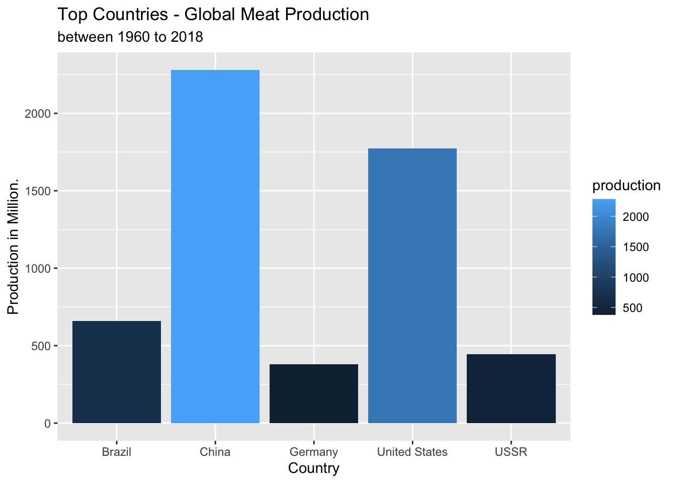
2.9 Line graph of total amount of meat production
#Line graph illustrating global total amount of meat produced from 1960-2018.
v2_productiondf %>%
    group_by(year) %>%
    summarise(production = sum(production)) %>%
  ggplot(aes(x=year,(y=production/1000000)))+
  geom_line(colour="red")+
  theme_classic()+
  scale_x_continuous(breaks = round(seq(min(v2_productiondf$year), max(v2_productiondf$year), by = 5)))+
  labs(y="Production in Millions", x= "Year",title="Total Global Meat Production", subtitle ="between 1960 to 2018")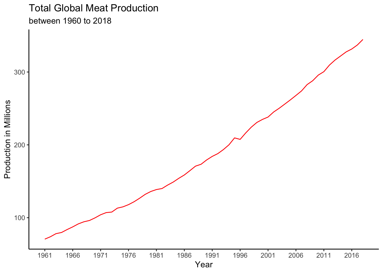
2.10 Line graph of top total amount of meat production
#Line graphs illustrating top global total amount of meat produced from 1960-2018.
country_max <- v2_productiondf %>%
  select(c(country,production,year)) %>%
  group_by(country)%>%
  summarise(production = sum(production))%>%
  mutate(type = 'max') %>%
  arrange(desc(production)) %>%
  head(5)
v2_productiondf %>%
  select(country, year, production) %>%
  inner_join(country_max,by="country") %>%
  mutate( production_mio = production.x / 1000000) %>%
  select(c(country,year,production_mio)) %>%
ggplot(aes(x=year,y=production_mio, colour = country))+
  geom_line(size=2)+
  scale_x_continuous(breaks = round(seq(min(v2_productiondf$year), max(v2_productiondf$year), by = 5)))+
  theme_classic()+
  labs(y="Production in Millions", x= "Year",title="Top Countries of Total Global Meat Production", subtitle ="between 1960 to 2018")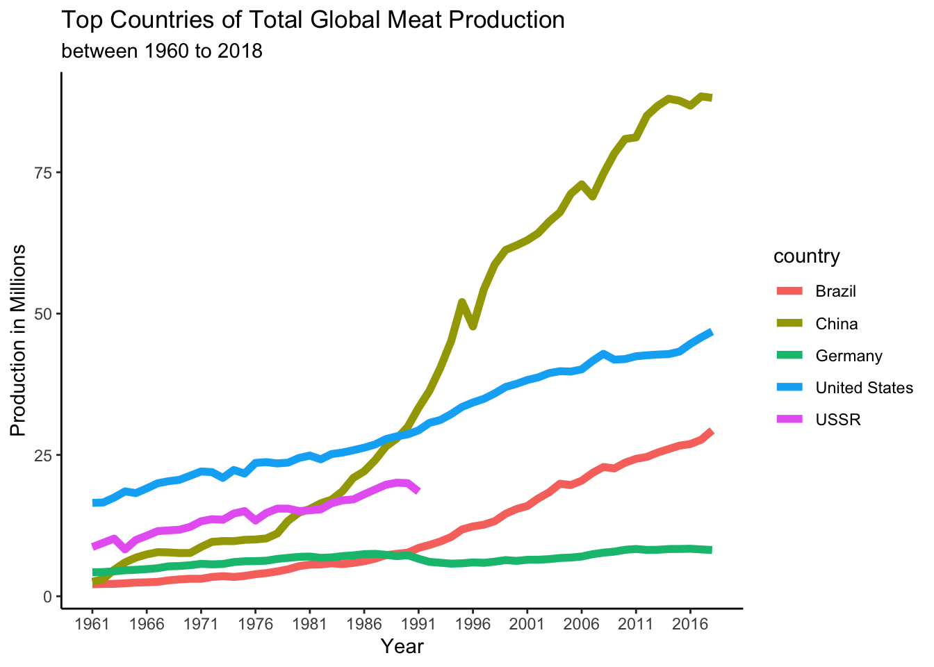
2.11 Line graph of China producing meat
#Line graph showing China as one of the top countries that mass produces meat from 1960-2018.
v2_productiondf %>%
  filter(country == "China") %>%
  select(country,year,production) %>%
  ggplot(aes(x=year, y=production/100000))+
  geom_line(colour="green",size=1.5)+
  scale_x_continuous(breaks = round(seq(min(v2_productiondf$year), max(v2_productiondf$year), by = 5)))+
  theme_bw()+
  labs(y="Production in Millions", x= "Year",title="Global Meat Production per Year from China", subtitle ="between 1960 to 2018")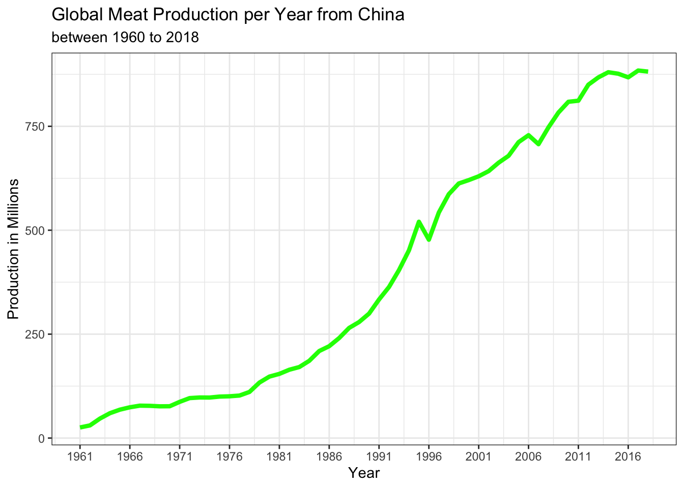
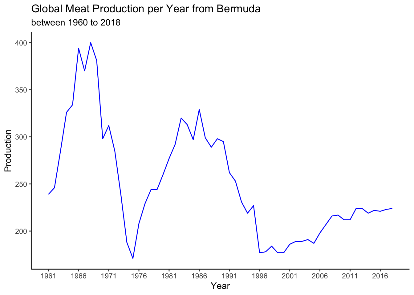
2.12 Line graph of Bermuda producing meat
#Line graph showing Bermuda as one of the bottom countries that mass produces meat from 1960-2018.
v2_productiondf %>%
  filter(country == "Bermuda") %>%
  select(country,year,production) %>%
  ggplot(aes(x=year, y=production,fill=year ))+
  geom_line(colour="blue")+
  scale_x_continuous(breaks = round(seq(min(v2_productiondf$year), max(v2_productiondf$year), by = 5)))+
  theme_classic()+
  labs(y="Production", x= "Year",title="Global Meat Production per Year from Bermuda", subtitle ="between 1960 to 2018")